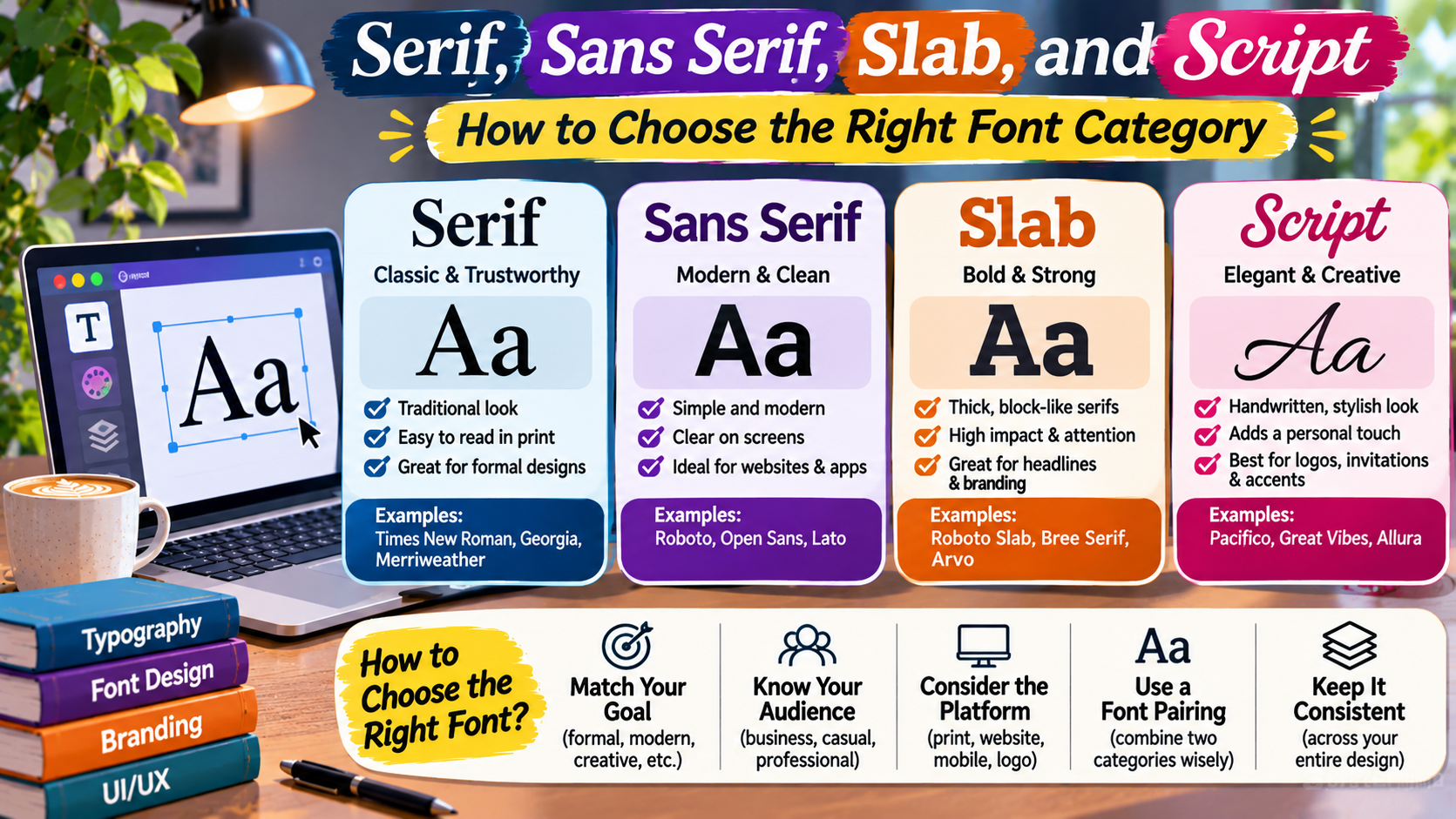
The Typography Handbook / Design Fundamentals
The right typeface changes how your message feels.
From elegant serif lettering to modern sans serif interfaces, understanding font categories helps you create clearer, more consistent, and more expressive designs.
SERIF
SANS
SLAB
SCRIPT
Typography is one of the most important parts of visual communication.
Whether you are designing a website, creating a logo, preparing a presentation, or building a brand identity, the fonts you choose influence how people experience your content.
A formal invitation may benefit from elegant lettering, while a mobile application usually needs clear and practical typography.
A newspaper-inspired website might use a traditional serif typeface, whereas a modern software dashboard may rely on a straightforward sans serif family.
But these are design tendencies, not strict rules.
The best font depends on the message, audience, reading environment, and overall visual identity.
Four widely recognized font categories are serif, sans serif, slab serif, and script.
Understanding their characteristics can help you choose typography more confidently and avoid common design mistakes.
What Are Font Categories?
Font categories group typefaces according to shared visual characteristics.
These characteristics may include letter shapes, stroke contrast, decorative details, proportions, and the presence or absence of serifs.
A serif is a small finishing stroke or projection attached to the end of a larger letter stroke.
Some typefaces feature prominent serifs, while others have none.
Other categories are distinguished by heavier structural details or handwriting-inspired forms.
Understanding these differences helps designers predict how a typeface might perform in different situations.
Typography Terminology
Typeface vs. Font
A typeface is a family of related letter designs. A font traditionally refers to a specific style, weight, or implementation within that family. In everyday digital design, the terms are often used interchangeably.
1. Serif Fonts: Traditional, Editorial, and Expressive
The Editorial Look
Example appearance: Georgia / Traditional Serif
Serif typefaces contain small finishing strokes at the ends of many letterforms.
These details can create a traditional, literary, formal, or editorial appearance.
Serif typography has a long history in printed books, newspapers, magazines, and academic publications.
However, serif fonts are not limited to traditional designs.
Contemporary serif typefaces can feel elegant, experimental, luxurious, or highly modern depending on their proportions and details.
Where Serif Fonts Work Well
Serif typefaces are commonly used in long-form articles, editorial websites, books, luxury branding, and formal publications.
They can also create distinctive headings and memorable brand identities.
For example, a literary magazine might use a serif typeface for both headlines and article text.
A premium fashion website might use a high-contrast serif for large display headings while keeping the navigation in a sans serif.
Potential Limitations
Some highly decorative or delicate serif typefaces can become difficult to read at small sizes.
Thin strokes may lose clarity on certain displays or when rendered at low resolution.
However, a well-designed serif typeface can perform very effectively in digital body text.
The important factors are the specific typeface, font size, spacing, rendering quality, and reading context.
2. Sans Serif Fonts: Clean, Flexible, and Practical
Modern & Clear
Example appearance: Arial / Sans Serif
Sans serif typefaces do not have the traditional finishing strokes found in serif designs.
The word “sans” means “without.”
Sans serif letterforms often have relatively simple outlines, although their visual personalities can vary considerably.
Some appear geometric and structured.
Others feel friendly, humanist, technical, or neutral.
This flexibility makes sans serif typography common in modern digital interfaces.
Where Sans Serif Fonts Work Well
Sans serif typefaces are frequently used for website navigation, application interfaces, dashboards, product pages, and digital forms.
They are also common in corporate branding, presentations, and contemporary advertising.
For example, a project management application might use a sans serif family throughout its interface.
Consistent letterforms and multiple available weights can help establish hierarchy between headings, labels, and supporting text.
Potential Limitations
Not every sans serif typeface is equally readable.
Some geometric designs have letterforms that look similar, making certain characters harder to distinguish.
Extremely thin weights can also reduce readability, especially at small sizes.
Choosing a sans serif font should involve evaluating its actual letterforms rather than assuming that every sans serif is automatically suitable for interfaces.
3. Slab Serif Fonts: Bold, Structured, and Distinctive
Strong Headlines
Illustrative Slab Serif Style
Slab serif typefaces are a distinctive branch of serif typography.
They typically feature thick, block-like serifs that create a strong structural appearance.
Compared with many traditional serif designs, slab serifs often have heavier and more prominent finishing strokes.
Some slab serif families have relatively uniform stroke widths, while others show greater variation.
The category includes a wide range of personalities, from industrial and mechanical to friendly and contemporary.
Where Slab Serif Fonts Work Well
Slab serifs can be effective for headlines, posters, packaging, sports branding, editorial titles, and promotional materials.
Their substantial letterforms can help short messages stand out.
For example, a coffee brand might use a bold slab serif in its logo to create a sturdy, recognizable identity.
An editorial website could use a slab serif for section headings while relying on a simpler typeface for body text.
Potential Limitations
Heavy slab serif fonts can dominate a composition if used excessively.
Some display-oriented families may feel crowded in long paragraphs.
However, slab serif typefaces designed specifically for extended reading can work well in body text.
The suitability depends on the individual family rather than the category alone.
4. Script Fonts: Personal, Decorative, and Expressive
A Personal Touch
Handwriting-Inspired Typography
Script typefaces are inspired by handwriting, calligraphy, and lettering traditions.
They often feature flowing strokes, connected letters, or expressive shapes.
Some script fonts resemble formal calligraphy.
Others imitate casual handwriting, brush lettering, or decorative signatures.
Because script designs vary significantly, they can communicate very different visual personalities.
Where Script Fonts Work Well
Script typefaces are commonly used for invitations, greeting cards, logos, packaging, decorative headings, and short promotional messages.
They can add personality to a design when used selectively.
For example, a bakery might use a casual script for its brand name while keeping product descriptions in a readable sans serif.
A formal event invitation might use an elegant calligraphic script for names or selected headings.
Potential Limitations
Decorative script fonts can be difficult to read, especially in long paragraphs or small interface labels.
Connected letters and unusual shapes may reduce character recognition.
For this reason, many script typefaces are better suited to short display text than essential instructions or lengthy content.
Always test script lettering at the size and in the environment where it will actually appear.
Serif vs. Sans Serif vs. Slab vs. Script: Key Differences
Each category has recognizable characteristics, but none is automatically superior to the others.
The following comparison provides a practical overview.
| Category | Main Feature | Common Uses | Consideration |
|---|---|---|---|
| Serif | Finishing strokes | Books, articles, editorial branding | Check small-size clarity |
| Sans Serif | No traditional serifs | Interfaces, websites, presentations | Check character distinction |
| Slab Serif | Heavy, block-like serifs | Headlines, packaging, branding | Manage visual weight |
| Script | Handwriting-inspired forms | Invitations, logos, decorative text | Avoid difficult long-form text |
These categories describe general characteristics rather than fixed rules about readability or emotional meaning.
How to Choose the Right Font for a Website
Website typography should support both visual identity and practical reading.
Start by identifying the purpose of the website.
A news publication, online store, software dashboard, and creative portfolio may have different typography needs.
For a content-heavy website, prioritize comfortable paragraph reading.
For an application, pay attention to interface labels, buttons, tables, and small text.
For a portfolio, expressive display typography may be appropriate, but important navigation and project information should remain clear.
Consider the following factors before selecting a font family.
Readability at Different Sizes
Test headings, paragraphs, captions, and buttons.
A typeface that looks impressive at 60 pixels may become difficult to read at 14 pixels.
Character Recognition
Check whether similar-looking characters are easy to distinguish.
Pay attention to lowercase letters, numerals, punctuation, and characters commonly used in forms.
Language Support
Make sure the typeface supports the languages and writing systems your audience uses.
A font with attractive English lettering may not contain the characters required for other languages.
Performance and Licensing
Web fonts can affect page loading performance.
Using unnecessary families and weights increases the amount of font data a browser may need to download.
Also verify that the font license permits your intended website, application, or commercial use.
How to Pair Different Font Categories
Font pairing involves combining typefaces that complement one another while maintaining clear hierarchy.
A common approach is to use one family for headings and another for body text.
For example, a serif heading can create an editorial identity while a sans serif body font provides a different reading texture.
A slab serif headline can work alongside a restrained sans serif paragraph.
A decorative script may be paired with a simple serif or sans serif to keep essential information readable.
Example: Editorial Font Pairing
A Thoughtful Approach to Design
This example combines a traditional serif headline with a straightforward sans serif paragraph. The difference in letterform structure creates contrast while preserving readability.
Successful font pairing does not require dramatic contrast.
Sometimes a single typeface family with several weights and styles is enough to create a complete visual hierarchy.
Using too many unrelated fonts can make a design appear inconsistent.
For many projects, one or two carefully selected families provide sufficient flexibility.
Font Weight, Size, and Spacing Matter Too
Choosing the right category is only the beginning.
Typography also depends on font size, weight, line height, letter spacing, and paragraph width.
A readable font can become uncomfortable when lines are too long or vertical spacing is too tight.
Similarly, an attractive heading may lose its impact if every other element uses the same size and weight.
For body text, choose a size that remains comfortable on the intended devices.
Line height should provide enough space between lines without making paragraphs feel disconnected.
Line length also matters.
Very wide paragraphs can make it harder for readers to locate the beginning of the next line.
There is no single perfect setting for every typeface, so evaluate the complete reading experience rather than following one fixed formula.
Typography and Accessibility
Accessible typography helps more people read and understand digital content.
Font category alone does not determine accessibility.
A well-designed serif typeface may be easier to read than a poorly designed sans serif, and the reverse can also be true.
Important considerations include sufficient text contrast, comfortable sizing, distinguishable characters, and responsive layouts.
WCAG Level AA generally requires a contrast ratio of at least 4.5:1 for normal text and 3:1 for large text.
Text should also remain usable when people enlarge it or adjust their browser settings.
Avoid using decorative scripts for essential instructions, form labels, or lengthy passages when their letterforms reduce clarity.
Accessibility testing should involve the actual typography, content, and interface rather than assumptions based on font category.
Accessibility Reminder
A font’s appearance does not guarantee readability. Test text size, spacing, contrast, character clarity, and responsiveness together.
Common Font Selection Mistakes
One common mistake is choosing a typeface only because it looks attractive in a sample image.
Fonts should be evaluated with the actual content they will display.
Another mistake is assuming that a particular category always communicates the same personality.
Not every serif is formal, and not every sans serif is modern.
Other common problems include:
- Using decorative script fonts for long paragraphs.
- Combining too many unrelated font families.
- Choosing extremely thin weights for small text.
- Ignoring mobile readability.
- Using fonts without checking language support.
- Failing to verify commercial licensing requirements.
- Relying on font category instead of testing actual letterforms.
A good typography system should make the message easier to understand while supporting the intended visual identity.
A Simple Exercise for Choosing Your Fonts
Choose a short heading and a paragraph from your actual project.
Set the same content in a serif typeface, a sans serif typeface, and a slab serif typeface.
If appropriate, try a script typeface for the heading only.
Keep the text content consistent so you can compare the visual differences fairly.
Next, evaluate each option at desktop and mobile sizes.
Check whether the heading communicates the intended personality and whether the paragraph remains comfortable to read.
Also compare different font weights and line spacing.
You may discover that the strongest solution is not the most decorative option.
The best typography often supports the content without drawing unnecessary attention to itself.
Frequently Asked Questions
What is the main difference between serif and sans serif fonts?
Serif typefaces contain finishing strokes on many letterforms, while sans serif typefaces generally do not.
Are serif fonts harder to read on screens?
Not necessarily. Modern displays can render well-designed serif typefaces clearly. Readability depends on the specific font, size, spacing, and context.
What makes a slab serif different from a regular serif?
Slab serif typefaces typically feature thicker, block-like serifs that create a more substantial visual structure.
Can script fonts be used on websites?
Yes. Script fonts can work well for decorative headings, logos, and selected visual elements. Essential information should remain easy to read.
How many font families should a website use?
Many websites work effectively with one or two families. More can be used when there is a clear design reason, but unnecessary variety can reduce consistency.
Which font category is best for professional branding?
There is no universal best category. Professional branding can use serif, sans serif, slab serif, or carefully selected script typography depending on the brand’s identity and audience.
Final Thoughts
Serif, sans serif, slab serif, and script typefaces each offer different visual characteristics.
Serif fonts can create editorial depth and traditional character.
Sans serif fonts offer flexible letterforms that are widely used in modern interfaces.
Slab serif fonts provide distinctive structure and visual weight.
Script fonts introduce handwriting-inspired expression and decorative personality.
However, the right choice depends on more than the category.
Readability, accessibility, brand identity, language support, and the intended medium all influence whether a typeface is suitable.
Start with the purpose of your design, test fonts using real content, and build a consistent hierarchy.
When typography supports both the message and the audience, it becomes a powerful part of effective visual communication.
Typography Selection Guide
Serif — Editorial character
Sans Serif — Practical flexibility
Slab Serif — Strong structure
Script — Expressive personality
Choose based on purpose, test for readability, and keep your typography consistent across the design.