The Typography Archive / History of Design
From Cast Metal to Glowing Screens
The remarkable journey of typography reveals how changing technology transformed books, newspapers, websites, and the everyday experience of reading.
Today, changing a font takes only a few clicks.
A writer can select a typeface, adjust its size, increase line spacing, and publish an article that readers can open almost instantly on their phones.
For much of printing history, typography was a physical process.
Letters were cast in metal, arranged into lines, locked into printing forms, and pressed onto paper.
Every change required physical work, specialized equipment, and considerable skill.
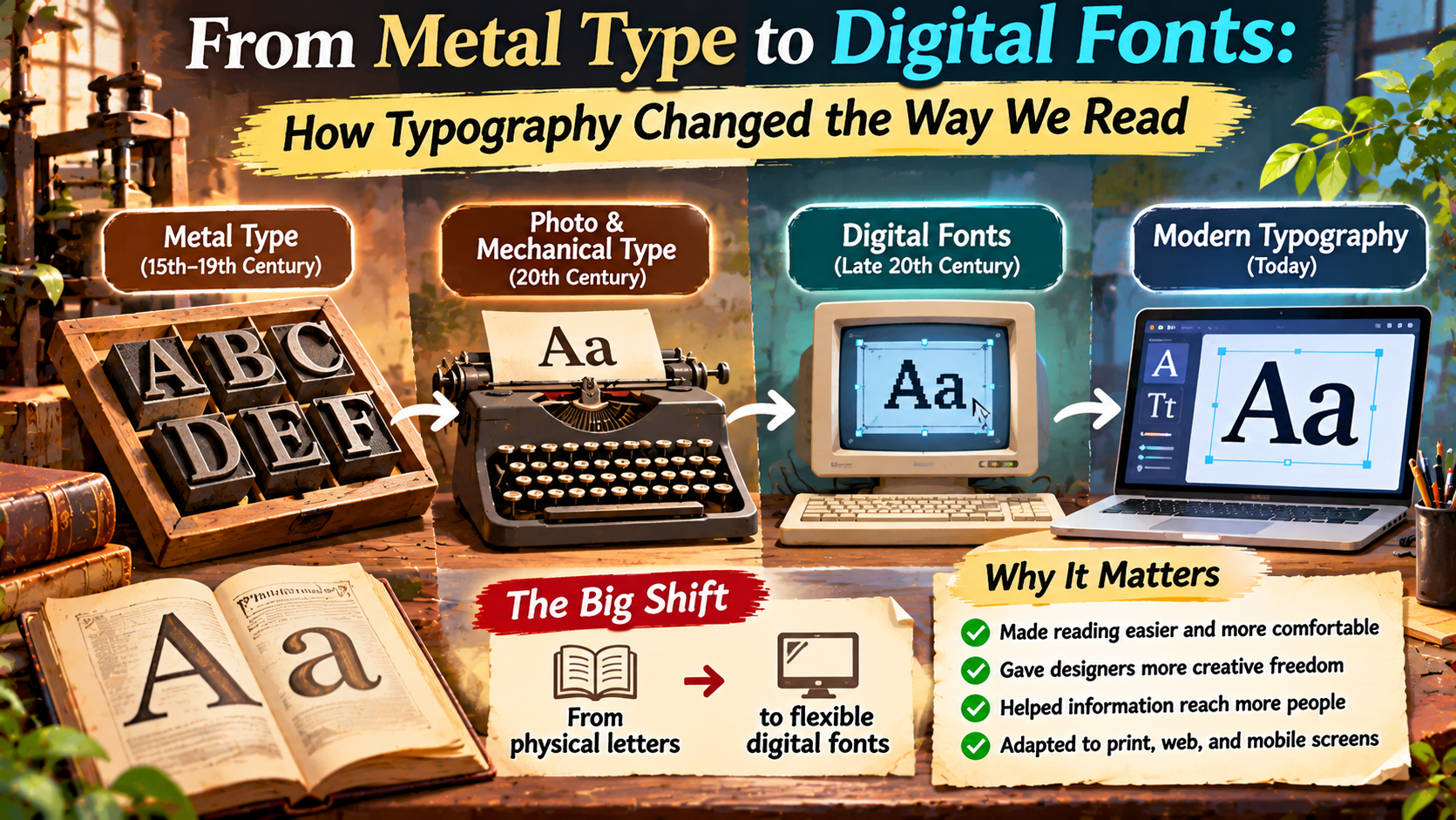
The transition from metal type to digital fonts changed far more than the appearance of letters.
It transformed how information was produced, distributed, updated, and experienced.
Understanding this history helps explain why modern typography works the way it does—and why choices such as font size, line length, spacing, and screen layout remain important.
Before Metal Type: The Origins of Printed Letterforms
The history of typography did not begin with digital screens or European printing presses.
For centuries, written information was reproduced by hand.
Scribes copied religious texts, legal documents, literature, and educational materials using carefully developed writing traditions.
Handwritten manuscripts could be visually sophisticated, but producing multiple copies required significant time and labor.
Printing methods gradually offered alternatives.
Woodblock printing developed in East Asia long before European movable-type printing became widespread.
Movable type also has an important history in East Asia.
Bi Sheng developed a movable-type system using ceramic characters in eleventh-century China.
Metal movable type was used in Korea centuries before Gutenberg’s printing system.
The surviving Korean Buddhist text known as Jikji, printed in 1377, is a notable example of early metal movable-type printing.
These developments demonstrate that printing technology evolved across different cultures and historical periods.
Historical Perspective
Movable type has a global history.
European printing transformed publishing in Europe, but earlier innovations in China and Korea were essential milestones in the broader history of movable-type technology.
Gutenberg and the Expansion of European Printing
In the mid-fifteenth century, Johannes Gutenberg developed a practical printing system in Europe that combined movable metal type with other important technologies.
His system included methods for producing reusable type, suitable printing ink, and a press capable of applying pressure to paper.
Gutenberg’s work was not simply the invention of individual metal letters.
Its importance lay in bringing multiple processes together into a system that could reproduce substantial quantities of printed material.
The Gutenberg Bible, produced in the 1450s, became one of the most famous early examples of European movable-type printing.
As printing spread across Europe, books became easier to reproduce and distribute.
Printed materials helped support religious debate, scholarship, education, and the circulation of new ideas.
However, the expansion of printing was gradual.
Books remained expensive for many people, literacy levels varied, and access to printed information was unequal.
Even so, movable-type printing established a foundation for the growth of publishing over the following centuries.
How Metal Type Actually Worked
Traditional letterpress printing relied on individual pieces of type.
Each piece contained a raised, reversed image of a character.
Printers arranged these pieces into lines and pages, applied ink to the raised surfaces, and transferred the impression onto paper.
Spacing materials were also physical objects.
Printers used pieces of metal and other materials to control spaces between words, lines, and sections.
The size of type was measured using established typographic units, including points.
Changing a heading or correcting a paragraph could require rearranging the physical composition.
This process demanded precision because misplaced letters, inconsistent spacing, or poorly aligned type could affect the printed result.
Inside a Traditional Print Shop
A
Individual Type
Reusable metal pieces represented characters.
Aa
Composition
Characters were assembled into lines and pages.
▤
Printing
Ink and pressure transferred the image to paper.
Physical type imposed practical limitations, but it also encouraged highly developed skills in spacing, alignment, and page composition.
Many principles established during this period remain relevant to digital typography.
The Industrial Age: Printing Becomes Faster
As demand for newspapers, books, and commercial printing increased, printers needed faster methods of production.
Industrial printing introduced improvements in presses, paper production, and typesetting equipment.
One major development was the Linotype machine, introduced in the late nineteenth century.
Rather than requiring a compositor to assemble every individual character by hand, Linotype systems allowed operators to enter text using a keyboard.
The machine assembled matrices and cast complete lines of type metal.
This process significantly accelerated composition for newspapers and other publications.
Monotype systems followed a different approach, casting individual characters through a mechanized process.
These technologies helped expand the scale and speed of printed communication.
Newspapers could prepare substantial amounts of text more efficiently, while publishers gained additional production flexibility.
A Timeline of Major Typography Developments
11TH CENTURY
Early Movable Type in China
Bi Sheng develops a movable-type system using ceramic characters.
1377
Korean Metal-Type Printing
Jikji provides an important surviving example of metal movable-type printing.
1450S
Gutenberg’s Printing System
Movable metal type becomes central to a transformative European printing system.
1880S
Linotype Mechanization
Keyboard-operated composition accelerates newspaper and commercial printing.
20TH CENTURY
Phototypesetting Expands
Photographic and electronic methods increasingly replace hot-metal composition.
1980S
Desktop Publishing
Personal computers, digital type, and page-layout software reshape publishing workflows.
1990S TO PRESENT
Web and Responsive Typography
Digital fonts become essential to websites, applications, and reading across different devices.
Phototypesetting: Moving Beyond Physical Letters
During the twentieth century, phototypesetting introduced another major shift.
Instead of casting every line from metal, phototypesetting systems used photographic processes to produce text images.
Different systems employed optical, photographic, and eventually electronic technologies.
This reduced the need for physical metal type in many publishing workflows.
Designers gained new possibilities for adjusting type sizes and arranging text.
Phototypesetting also contributed to changes in the appearance of magazines, advertising, and commercial publications.
Large headlines, tighter spacing, and experimental layouts became easier to produce in many settings.
However, phototypesetting was not yet the same as modern digital typography.
Specialized equipment and professional production processes were still required.
Desktop Publishing Changes Everything
The development of personal computers and digital page-layout software transformed typography during the 1980s.
Desktop publishing made it possible to combine writing, typography, images, and page composition within a computer-based workflow.
Technologies such as PostScript helped describe text and graphics for high-quality output.
Digital typefaces could be stored as computer data rather than existing only as physical printing materials or photographic masters.
Writers, designers, and publishers gained greater control over layout decisions.
Changing a heading size no longer required physically replacing type.
Adjusting margins, moving paragraphs, and experimenting with fonts became much faster.
These changes lowered some of the technical barriers to producing professional-looking documents.
However, easier access to typography did not automatically guarantee better design.
People still needed to understand hierarchy, spacing, readability, and visual consistency.
What Makes a Digital Font Different?
A digital font contains information that allows computers to display or print characters.
Modern outline fonts typically describe glyph shapes using mathematical curves and related data.
This allows letterforms to be scaled across different sizes without requiring a separate physical piece of type for each size.
Font files may also contain spacing information, character mappings, kerning data, and instructions that help software position and render glyphs.
Different font technologies have developed over time.
TrueType and OpenType are important examples used in modern typography.
OpenType supports sophisticated typographic features, including certain ligatures, alternate characters, and language-specific shaping capabilities.
The exact features available depend on the font and the software displaying it.
Digital fonts also make it easier to distribute typography across devices and publishing systems.
How Digital Typography Changed Reading
The shift to digital fonts transformed the experience of reading in several important ways.
1. Readers Can Adjust Text
Printed books usually have fixed typography.
Digital reading systems can allow users to increase font size, change line spacing, or select different display settings.
These options can improve comfort for people with different reading preferences and visual needs.
2. Text Can Adapt to Different Screens
Responsive websites can adjust text layout according to available screen space.
A paragraph that appears across a wide desktop layout can reflow into a narrower mobile column.
This flexibility is one of the major differences between fixed printed pages and many digital reading environments.
3. Information Can Be Updated Quickly
Printed materials generally require a new edition or reprint to correct substantial errors.
Digital articles can often be updated without reproducing physical copies.
This makes corrections and revisions easier, although readers still need reliable information and transparent editorial practices.
4. Reading Becomes More Interactive
Digital text can include hyperlinks, search functions, navigation tools, annotations, and other interactive features.
These capabilities change how readers move through information.
Instead of always reading from beginning to end, users may scan headings, follow links, or search for specific terms.
Typography must support these different reading behaviors.
Print Typography vs. Digital Typography
Print and digital typography share many foundational principles, but their practical requirements differ.
| Feature | Traditional Print | Digital Reading |
|---|---|---|
| Layout | Usually fixed after printing | Often responsive or adjustable |
| Text Size | Determined during production | May be adjustable by users |
| Corrections | May require reprinting | Can often be published quickly |
| Navigation | Pages, indexes, contents | Links, search, menus, scrolling |
| Reading Environment | Paper, ink, physical lighting | Screens, brightness, display settings |
Neither medium is automatically superior for every purpose.
Printed books offer a stable physical layout, while digital formats provide flexibility and interactive capabilities.
Good typography responds to the strengths and limitations of its medium.
The Rise of Web Fonts
Early websites were often limited to fonts installed on the visitor’s computer.
Designers commonly relied on familiar system typefaces and fallback font stacks.
As browser technology developed, web fonts made it possible to deliver additional typefaces with website content.
This expanded creative possibilities for online branding and editorial design.
Websites could develop more distinctive typographic identities without depending entirely on the fonts already installed on a device.
However, web fonts introduced performance considerations.
Large font files, unnecessary weights, and excessive font families can increase download requirements.
Designers therefore need to balance visual identity with loading performance and readability.
Variable Fonts: More Flexibility in One File
Variable fonts represent another important development in digital typography.
Traditional font families often provide separate files for different weights or styles.
A variable font can support a continuous range of values along one or more design axes.
Common axes include weight, width, and optical size.
Some variable fonts also include custom axes developed by their designers.
This can provide greater flexibility for responsive typography and interface design.
For example, a designer may adjust the weight of a heading without switching between several separate font files.
Variable fonts can sometimes improve delivery efficiency, but their performance benefits depend on the file, supported axes, and implementation.
They are not automatically smaller or faster in every situation.
Why Typography Still Matters for Readability
Technology has changed how text is produced, but the fundamental challenge remains the same.
Readers need to recognize letters, understand words, and move comfortably through information.
Font selection alone does not determine readability.
Line length, font size, contrast, spacing, paragraph structure, and screen conditions all influence the reading experience.
A beautifully designed typeface can become difficult to read if it is displayed too small or with insufficient contrast.
Similarly, an ordinary typeface can work extremely well when supported by thoughtful layout decisions.
For digital content, designers should test typography on actual devices rather than evaluating it only in large desktop previews.
Mobile screens, browser zoom, and accessibility settings can reveal problems that are not obvious in a static design mockup.
Modern Reading Principle
Technology changes. Readability remains essential.
Whether text is printed with metal type or displayed through a digital font, clear letterforms, thoughtful spacing, and strong visual hierarchy remain central to effective communication.
What Designers Can Learn From Typography History
The history of typography offers several practical lessons for modern designers.
First, technological convenience should not replace careful design judgment.
Digital tools make it easy to change fonts, but unlimited options can also create inconsistent typography.
Second, hierarchy remains important.
Printers used size, weight, spacing, and placement to distinguish headings from body text long before digital interfaces existed.
Third, typography should respond to its medium.
Letters designed for large printed posters may not perform well as small mobile interface labels.
Finally, accessibility should be part of the design process.
Modern technology provides opportunities to make text adjustable and adaptable, but designers must implement those capabilities thoughtfully.
Frequently Asked Questions
Who invented movable type?
Movable type developed through multiple historical innovations. Bi Sheng created a ceramic movable-type system in eleventh-century China, and metal movable type was used in Korea before Gutenberg’s European printing system.
Why was Gutenberg’s printing system important?
It combined practical technologies that enabled the reproduction of printed materials on a larger scale in Europe, helping transform publishing and the circulation of information.
What is the difference between metal type and digital fonts?
Metal type uses physical pieces with raised letterforms for printing. Digital fonts store information that software uses to display or print characters.
When did desktop publishing become popular?
Desktop publishing expanded significantly during the 1980s as personal computers, digital typography, and page-layout software became more capable and accessible.
How did digital fonts change reading?
Digital fonts helped make text scalable, adaptable, searchable, and suitable for different screen sizes and interactive reading environments.
Are digital fonts better than traditional printing?
They offer different capabilities. Digital typography provides flexibility and easier updates, while printed typography offers a stable physical reading experience. The better choice depends on the purpose.
Final Thoughts: The Continuing Evolution of Typography
The journey from metal type to digital fonts is a story of technological innovation and changing communication habits.
Early movable-type systems demonstrated that written information could be reproduced using reusable characters.
European printing systems expanded the scale of book production, while industrial typesetting accelerated newspapers and commercial publishing.
Phototypesetting reduced dependence on physical metal composition.
Desktop publishing brought typography into computer-based workflows, and digital fonts transformed how text appears on screens.
Today, responsive layouts, web fonts, and variable font technology continue to expand the possibilities of visual communication.
Yet the purpose of typography remains remarkably consistent.
It helps people recognize language, navigate information, and understand ideas.
From carefully arranged metal letters to adjustable text on a smartphone, typography continues to shape not only how words look, but also how we experience reading itself.
The Lasting Lesson
From physical letters to digital information, typography has always connected technology with human understanding.
The tools have changed dramatically, but clear, accessible, and thoughtful typography remains essential to the way we read.