L

Logan

Principal Typeface Designer & Chief Typography Editor

Logan is a seasoned typographic scholar and UI engineer with over a decade of research into font classification mechanics, variable font axis math, and editorial readability. Below are all 20 published research essays.

How to Choose Font Size, Line Height, and Line Length for Comfortable Reading
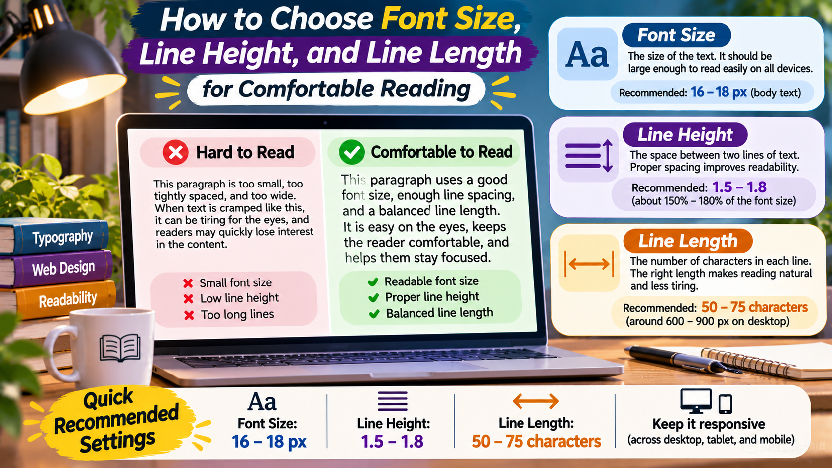
Reading Experience Lab / Typography Essentials Comfortable reading starts with the right proportions. Discover how font size, line height, and line length work together to make digital content clearer, more accessible, and easier to follow. A Better Reading Rhythm Thoughtful typography gives every line enough space to breathe. Readers can move naturally from one sentence … Read more
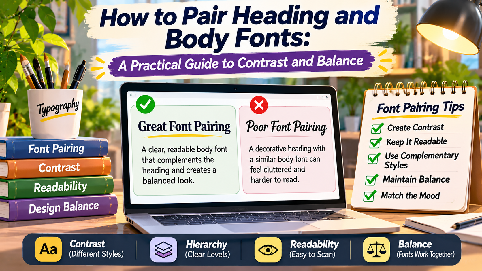
How to Pair Heading and Body Fonts Practical Guide to Contrast and Balance

Typography Studio / The Art of Font Pairing Two Fonts.One Visual Language. Learn how to combine heading and body typefaces that create contrast, maintain harmony, and make your content easier to read. A Better Reading Experience A distinctive heading attracts attention, while clear body typography keeps readers engaged with the content. Choosing one font for … Read more

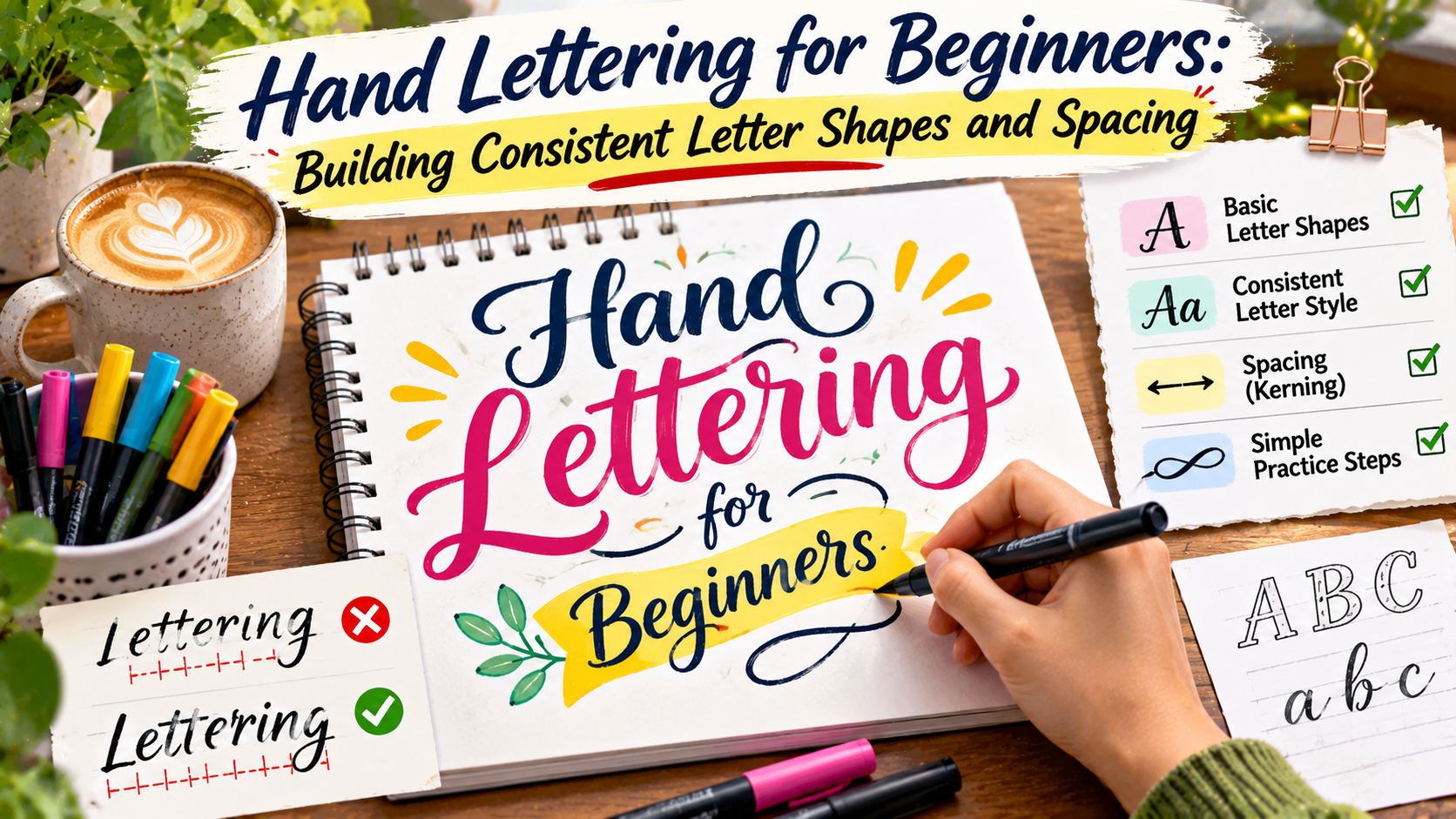
Hand Lettering for Beginners Building Consistent Letter Shapes and Spacing

Creative Lettering Studio / Beginner Workbook Beautiful letters begin with simple shapes. Learn how to draw balanced letterforms, control spacing, and develop a consistent hand-lettering style through practical exercises. Create with Confidence Draw • Refine • Repeat Hand lettering is a creative way to turn ordinary words into expressive visual designs. Unlike everyday handwriting, hand … Read more

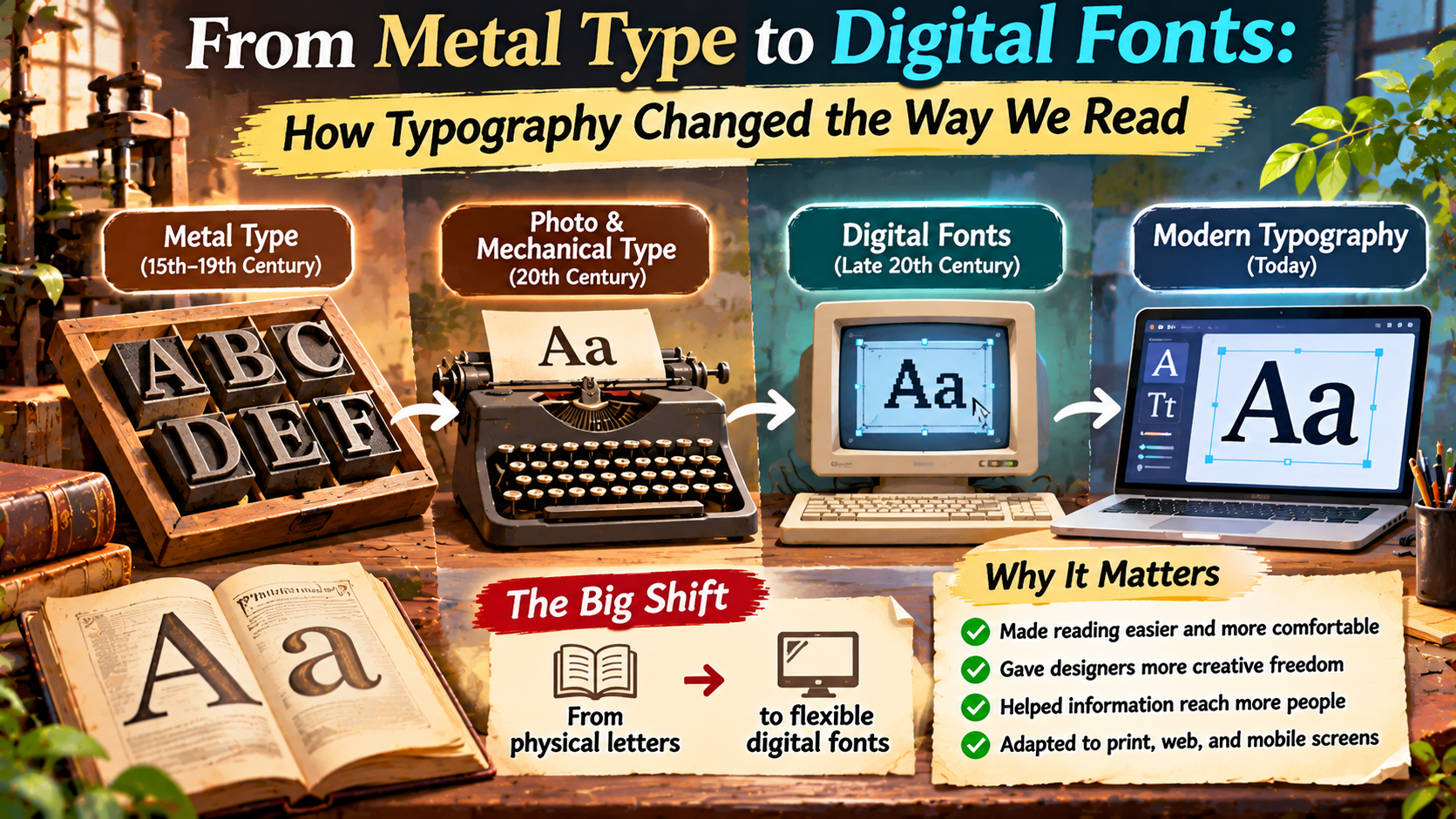
From Metal Type to Digital Fonts How Typography Changed the Way We Read

The Typography Archive / History of Design From Cast Metal to Glowing Screens The remarkable journey of typography reveals how changing technology transformed books, newspapers, websites, and the everyday experience of reading. METAL TYPE → MECHANICAL PRINTING → PHOTOTYPE → DIGITAL FONTS Today, changing a font takes only a few clicks. A writer can select … Read more

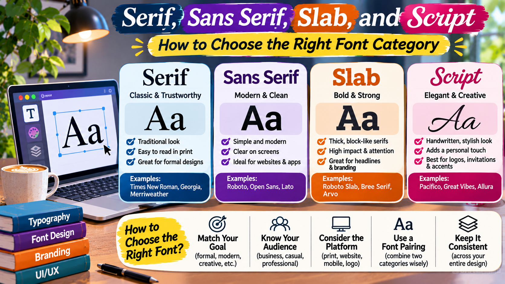
Serif, Sans Serif, Slab, and Script How to Choose the Right Font Category

The Typography Handbook / Design Fundamentals The right typeface changes how your message feels. From elegant serif lettering to modern sans serif interfaces, understanding font categories helps you create clearer, more consistent, and more expressive designs. Aa SERIF Aa SANS Aa SLAB Aa SCRIPT Typography is one of the most important parts of visual communication. … Read more

Typography in UI/UX Design: Accessibility, WCAG Contrast Standards, and Mobile Readability

In contemporary User Interface (UI) and User Experience (UX) design, typography is not an aesthetic afterthought—it is the direct interface through which users interact with functionality, navigate software features, and complete vital tasks. Designing inclusive, accessible digital products requires adhering to the Web Content Accessibility Guidelines (WCAG 2.1 / 2.2), accommodating users with low vision, … Read more

Brand Identity and Typographic Voice: How Typeface Anatomy Influences Customer Perception

Typography is the subliminal soundtrack of branding. Long before a potential customer consciously reads a company’s marketing copy, values statement, or pricing table, their brain has already formed an instinctive emotional judgment based entirely on the shape, weight, curvature, and proportions of the brand’s letterforms. In the competitive arena of modern commerce, a brand’s Typographic … Read more

Micro-Typography and Macro-Typography: Mastering Spacing, Tracking, and Optical Alignment

To the untrained eye, typography appears to be nothing more than choosing a nice font and making it large or small. However, master typographers, book designers, and elite UI designers operate across two distinct structural dimensions: Macro-Typography (the overarching architecture of layouts, margins, column grids, and visual hierarchy) and Micro-Typography (the microscopic craftsmanship of letterforms, … Read more

Bold Branding Font Combinations: Pairing Sans-Serif and Display Typefaces for Maximum Impact

In modern commercial branding, a company’s visual identity must cut through the deafening noise of digital marketing, social media feeds, and billboard landscapes in a fraction of a second. Brand typography is not merely decorative; it is the visual spokesperson of a company’s values, ambition, and market positioning. Pairing a high-impact display typeface with a … Read more

Hierarchical Web Typography: Setting Scale, Line Height, Leading, and Kerning for Responsive UX

More than 90% of the information delivered across the World Wide Web is written text. As web pioneer Oliver Reichenstein famously stated, “Web Design is 95% Typography.” Creating a compelling digital product—whether an enterprise SaaS dashboard, an editorial news portal, or a high-converting e-commerce storefront—relies directly on mastering Typographic Hierarchy. Without clear visual hierarchy, readers … Read more