📚 Specialized Category Collection

Curated Typography Research & Guides

Browse specialized technical deep dives, historical analysis, practical pairing matrices, and professional typographic standards curated for this discipline.

How to Pair Heading and Body Fonts Practical Guide to Contrast and Balance
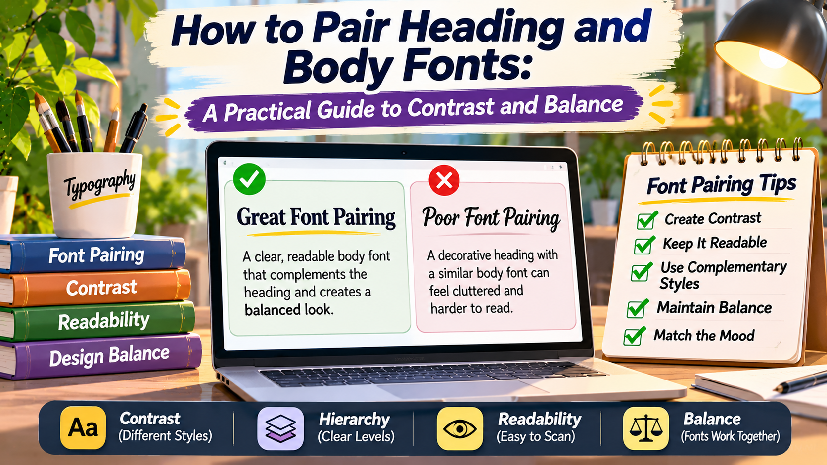
Typography Studio / The Art of Font Pairing Two Fonts.One Visual Language. Learn how to combine heading and body typefaces that create contrast, maintain harmony, and make your content easier to read. A Better Reading Experience A distinctive heading attracts attention, while clear body typography keeps readers engaged with the content. Choosing one font for … Read more

Bold Branding Font Combinations: Pairing Sans-Serif and Display Typefaces for Maximum Impact

In modern commercial branding, a company’s visual identity must cut through the deafening noise of digital marketing, social media feeds, and billboard landscapes in a fraction of a second. Brand typography is not merely decorative; it is the visual spokesperson of a company’s values, ambition, and market positioning. Pairing a high-impact display typeface with a … Read more

Editorial Font Pairings: Crafting Elegant Combinations for Magazines, Books, and Long-Form Reads

Editorial typography is the supreme test of a graphic designer’s sensitivity to nuance, spatial rhythm, and narrative immersion. Unlike fast marketing landing pages or ephemeral social media banners, editorial layouts—whether in physical printed coffee table books, literary magazines, quarterly financial journals, or long-form digital publications—demand hours of sustained reader engagement. Crafting flawless editorial font pairings … Read more

Top 25 Timeless Google Font Pairings for Modern Websites, SaaS Platforms, and UI Interfaces

Google Fonts has democratized typography across the World Wide Web, hosting over 1,500 open-source typeface families accessed billions of times every single day. However, having thousands of free fonts at your fingertips often leads to analysis paralysis. Selecting the ideal pairing that balances aesthetic elegance, micro-legibility across smartphone screens, fast page loading performance, and emotional … Read more

The Definitive Rules of Font Pairing: How to Create Flawless Harmony and Contrast in Design Systems

Pairing typefaces is one of the most challenging yet rewarding skills in visual communication. Great font pairings establish immediate visual hierarchy, guide the reader’s eye effortlessly across complex information architecture, and imbue a brand or editorial publication with distinct personality. Conversely, poor font combinations create visual friction, confuse reading order, and undermine user trust. This … Read more