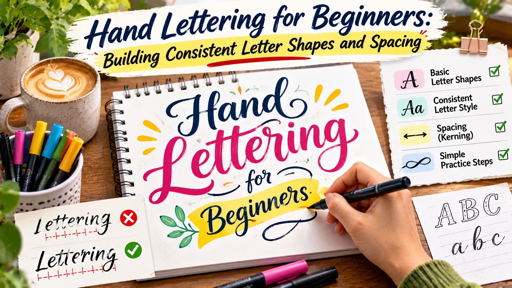
Creative Lettering Studio / Beginner Workbook
Beautiful letters begin with simple shapes.
Learn how to draw balanced letterforms, control spacing, and develop a consistent hand-lettering style through practical exercises.
Create with Confidence
Draw • Refine • Repeat
Hand lettering is a creative way to turn ordinary words into expressive visual designs.
Unlike everyday handwriting, hand lettering focuses on carefully drawing individual letterforms and arranging them into a balanced composition.
It is often used for greeting cards, posters, journal covers, invitations, packaging, social media graphics, and decorative artwork.
For beginners, one of the biggest challenges is making letters look consistent.
A word may contain attractive individual letters but still appear uneven because the shapes, heights, or spacing do not work together.
The good news is that consistency can be developed through observation and regular practice.
You do not need expensive equipment or advanced drawing experience to begin.
This guide explains how to build reliable letter shapes, improve spacing, and create lettering that looks intentional rather than accidental.
What Is Hand Lettering?
Hand lettering is the process of drawing letters as visual shapes.
Instead of writing each character quickly in a natural handwriting motion, you construct and refine the letterforms.
You may sketch a letter several times, adjust its proportions, and modify its curves until it fits the overall composition.
This distinguishes hand lettering from ordinary handwriting.
It also differs from calligraphy, which traditionally emphasizes creating letters through controlled writing strokes with specific tools.
However, the practices overlap, and many artists combine techniques from lettering, typography, and calligraphy.
Beginner Tip
Think of letters as drawings, not just writing.
Focus on their height, width, curves, and relationship to neighboring letters. Small adjustments can make an entire word look more balanced.
Start With Simple Lettering Materials
Beginners can practice hand lettering using a small collection of basic supplies.
A pencil, eraser, ruler, and smooth paper are enough for most foundational exercises.
A fine-tip pen can be useful when you are ready to outline finished letters.
Graph paper or dotted paper may help you maintain consistent proportions.
You can also use a digital drawing tablet, but digital tools are not necessary for learning the fundamentals.
Start with materials that allow you to sketch lightly and make corrections.
Using a pencil is especially helpful because lettering often involves several rounds of refinement.
Understand the Basic Anatomy of Letters
Before drawing decorative letterforms, it helps to understand a few basic typography terms.
These concepts provide a framework for building consistent shapes.
Baseline
The baseline is the imaginary line on which most letters sit.
Keeping letters aligned to a consistent baseline helps prevent words from looking uneven.
X-Height
X-height describes the height of typical lowercase letters such as x, a, and e, excluding ascenders and descenders.
Maintaining a consistent x-height helps lowercase letters feel related.
Ascenders and Descenders
Ascenders are parts of lowercase letters that extend above the x-height, such as those in b, d, and h.
Descenders extend below the baseline, as seen in letters such as g, p, and y.
These extensions should follow a consistent visual system.
Cap Height
Cap height refers to the height of flat-topped capital letters in a type design.
For hand lettering, it provides a useful guide for keeping uppercase characters consistent.
Letter Anatomy Practice
a b d g p x
Use horizontal guidelines to compare letter heights and alignment.
Build Letters From Basic Shapes
Many letters can be understood as combinations of simple geometric and curved forms.
Circles, ovals, straight lines, arches, and diagonal strokes appear repeatedly throughout the alphabet.
Learning to recognize these shared structures makes it easier to maintain consistency.
For example, lowercase letters such as a, c, d, g, o, and q often contain related rounded forms.
Letters such as h, m, n, and u can share similar arch structures.
Rather than treating every character as a completely separate drawing, practice groups of letters with common features.
This approach helps establish a recognizable lettering style.
Practice Rounded Letters
Begin by drawing a row of lowercase o shapes.
Try to keep their height, width, and curvature similar.
Next, use the same basic oval structure to develop letters such as a and d.
Observe whether the rounded portions feel consistent.
Practice Straight Strokes
Draw repeated vertical lines with similar height and thickness.
Then practice letters that use these structures, such as i, l, h, and t.
Consistent straight strokes can make an entire lettering style appear more organized.
Practice Curves and Arches
Draw repeated arches before moving to letters such as n, m, and h.
Focus on maintaining a similar curve and stroke rhythm.
These exercises may feel repetitive, but they develop control over the shapes that appear throughout the alphabet.
How to Keep Letter Heights Consistent
Uneven letter height is one of the most noticeable problems in beginner lettering.
For example, a word may contain lowercase letters that accidentally rise to different heights.
Even when each letter looks attractive individually, inconsistent proportions can make the word feel unstable.
Use light pencil guidelines before drawing.
Create separate lines for the baseline, x-height, and cap height.
If your style includes ascenders and descenders, add guides for those as well.
These lines do not need to remain visible in the finished artwork.
They simply provide a structure while you practice.
Remember that some rounded and pointed letters may extend slightly beyond mathematical alignment lines to appear visually equal in height.
This is known as optical adjustment.
The goal is visual consistency, not forcing every shape into identical geometric boundaries.
Understanding Letter Spacing
Letter spacing is the amount of space between neighboring characters.
Good spacing helps words feel balanced and easy to read.
However, equal numerical distances do not always produce equal visual spacing.
For example, two straight-sided letters may need a different amount of space than two rounded letters.
Diagonal letters can create large open areas that make gaps appear wider than they actually are.
This is why professional typography relies on optical spacing as well as measurements.
Hand lettering follows the same principle.
Instead of measuring every gap identically, evaluate the amount of visible empty space between shapes.
Spacing Comparison
TOO MUCH SPACING
CREATE
MORE COMPACT SPACING
CREATE
These examples illustrate spacing differences. The best spacing depends on the specific letter shapes and intended style.
What Is Kerning in Hand Lettering?
Kerning refers to adjusting the space between particular pairs of letters.
In digital typography, kerning may be built into the font or adjusted manually.
In hand lettering, you make these decisions while drawing the word.
Some letter combinations create awkward visual gaps.
For example, capital A and V contain diagonal shapes that can leave a large open area between them.
Moving them slightly closer may improve their visual relationship.
Other pairs may need additional space to avoid looking crowded.
Kerning is especially important in short words, logos, and large display lettering because spacing differences become more noticeable.
A useful technique is to step away from your drawing and examine the word as a complete shape.
Look for unusually large gaps or areas where letters appear to collide.
Make small adjustments until the spacing feels more even.
Maintain Consistent Stroke Thickness
Stroke thickness influences the personality and visual weight of lettering.
A monoline style uses strokes that appear relatively consistent in thickness.
Other styles use contrasting thick and thin strokes.
For beginners, monoline lettering can be a useful starting point because it allows you to concentrate on shapes and spacing.
Once you feel comfortable, experiment with varying stroke thickness.
If you choose a thick-and-thin style, develop a consistent rule for where heavier strokes appear.
For example, some lettering styles inspired by brush calligraphy use heavier downward strokes and lighter upward strokes.
However, this is not a universal rule for every lettering style.
Consistency matters more than following a particular decorative technique.
How to Space Entire Words and Lines
Letter spacing is only one part of a successful composition.
When lettering a phrase, you also need to consider word spacing and line spacing.
Words should be separated clearly enough that readers can identify them without effort.
However, excessively wide gaps can make a phrase feel disconnected.
Line spacing becomes especially important when a design contains multiple lines of lettering.
Decorative ascenders, descenders, and flourishes may extend into nearby lines.
Plan these details before committing to the final drawing.
Start by sketching the complete phrase lightly.
Check the overall width, alignment, and distribution of empty space.
Then refine individual letters.
This is usually more effective than perfecting one word before considering the rest of the composition.
A Simple Lettering Practice Routine
Regular practice helps develop better control over letter shapes and spacing.
You do not need to complete a complicated artwork every day.
Short exercises focused on one skill can be more useful than repeatedly attempting difficult compositions.
| Day | Practice Focus | Exercise |
|---|---|---|
| Day 1 | Basic strokes | Draw straight lines, curves, and ovals. |
| Day 2 | Rounded letters | Practice a, c, d, o, and q. |
| Day 3 | Letter heights | Use guidelines for lowercase and capitals. |
| Day 4 | Stroke consistency | Repeat letters with similar thickness. |
| Day 5 | Letter spacing | Draw short words and adjust visual gaps. |
| Day 6 | Word composition | Arrange a short phrase across two lines. |
| Day 7 | Final project | Create a small lettering poster. |
Repeat the routine with different styles as your confidence improves.
Keep your early practice sheets so you can compare your progress over time.
Common Beginner Lettering Mistakes
One common mistake is adding decorative flourishes before the basic letter shapes are balanced.
Decoration can make lettering more expressive, but it cannot fully compensate for inconsistent proportions.
Another mistake is drawing each letter independently without considering the complete word.
Letters need to work together as a visual system.
Other common problems include:
- Using inconsistent baselines.
- Changing x-height unintentionally.
- Making rounded letters different sizes.
- Ignoring awkward gaps between letter pairs.
- Adding too many decorative details.
- Using inconsistent stroke thickness.
- Skipping the initial pencil sketch.
- Trying to finish every design without revision.
Improvement comes from identifying one issue at a time and making deliberate adjustments.
How to Develop Your Own Lettering Style
Once you understand basic shapes and spacing, you can begin exploring different visual styles.
Try changing the width of your letters.
Experiment with rounded corners, sharper angles, taller proportions, or heavier strokes.
You might prefer playful bubble lettering, structured block letters, elegant scripts, or a simple monoline approach.
Study different lettering examples to understand how they are constructed.
Use those observations to develop original combinations rather than copying another artist’s finished composition.
Your personal style will usually become clearer through repeated experimentation.
Do not feel pressured to establish a signature style immediately.
Strong fundamentals give you more freedom to explore creative directions later.
A Beginner Project: Create a Lettered Quote Card
A small quote card is a useful first project because it combines letter construction with composition.
Choose a short phrase containing three to six words.
Start by writing the phrase in ordinary handwriting to understand its length.
Next, sketch a simple layout using light pencil guidelines.
Decide which word should receive the most emphasis.
Draw the letters slowly, checking their heights and widths as you work.
Adjust spacing between individual letters and words.
Once the overall composition feels balanced, refine the outlines.
Add decorative details only after the main lettering is readable.
Finally, erase unnecessary guidelines and review the finished design from a normal viewing distance.
Mini Lettering Project
Make Something
Beautiful Today
Try combining structured lettering with one expressive accent style.
Frequently Asked Questions
Is hand lettering difficult for beginners?
Hand lettering requires practice, but beginners can start with simple shapes, basic guidelines, and short words. Consistency improves through repetition.
What is the difference between hand lettering and calligraphy?
Hand lettering focuses on drawing letterforms, while calligraphy traditionally emphasizes producing letters through controlled writing strokes. The techniques can overlap.
How can I make my lettering more consistent?
Use guidelines for letter heights, practice groups of related shapes, maintain consistent stroke patterns, and review spacing across complete words.
What is the best pen for beginner lettering?
A regular pencil is a practical starting tool because it allows easy corrections. Fine-tip pens and brush pens can be introduced as your skills develop.
Why does my lettering look uneven?
Uneven lettering often results from inconsistent proportions, baselines, stroke thickness, or visual spacing. Practicing one issue at a time can help.
How long does it take to improve hand lettering?
Progress varies depending on practice frequency, previous drawing experience, and the complexity of the chosen style. Regular focused exercises can help develop control over time.
Final Thoughts
Hand lettering is a rewarding creative skill that combines drawing, typography, and visual composition.
For beginners, the most important goal is not creating elaborate decorative letters immediately.
It is learning how to build consistent shapes and arrange them with balanced spacing.
Start with basic strokes and related letter groups.
Use guidelines to control height and alignment.
Pay attention to the visible space between letters rather than relying only on equal measurements.
Practice short words before attempting complex phrases.
As your confidence grows, experiment with different lettering styles, decorative details, and compositions.
With patience and consistent practice, you can develop lettering that is both expressive and visually organized.
Your Beginner Lettering Checklist
✓ Build letters from simple shapes.
✓ Keep heights and strokes consistent.
✓ Adjust spacing visually.
✓ Practice before adding decoration.
Small improvements in shape, spacing, and alignment can make a remarkable difference in your finished lettering.