Reading Experience Lab / Typography Essentials
Comfortable reading starts with the right proportions.
Discover how font size, line height, and line length work together to make digital content clearer, more accessible, and easier to follow.
A Better Reading Rhythm
Thoughtful typography gives every line enough space to breathe. Readers can move naturally from one sentence to the next without unnecessary visual effort.
Good typography is not only about choosing an attractive font.
Even a well-designed typeface can become uncomfortable to read when the text is too small, the lines are too close together, or paragraphs stretch too far across the screen.
These problems are common on websites, blogs, digital publications, and mobile applications.
Readers may lose their place between lines, struggle to recognize characters, or find long paragraphs visually exhausting.
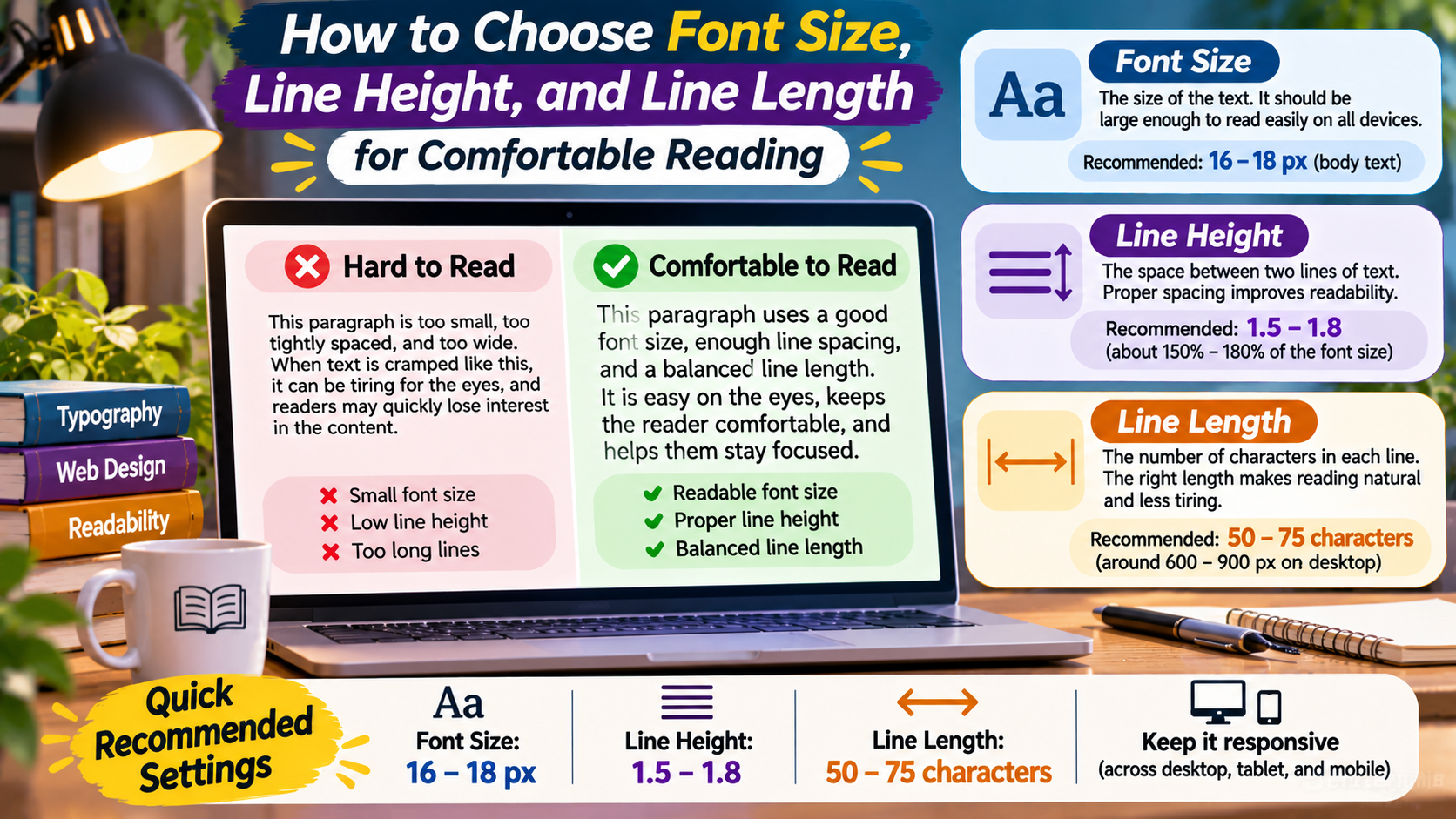
Three important typography settings help address these issues: font size, line height, and line length.
Each controls a different part of the reading experience.
Font size influences the visible scale of characters. Line height controls vertical spacing between lines. Line length determines how far the eye travels horizontally before moving to the next line.
These settings work together, so they should be evaluated as a system rather than adjusted independently.
This guide explains how to choose practical values for comfortable reading across desktop and mobile devices.
Why Typography Spacing Matters
Reading involves repeatedly recognizing characters, grouping words, and moving from one line to the next.
A comfortable layout supports these movements without drawing unnecessary attention to the typography itself.
When text is too small, readers may need to zoom or move closer to the screen.
When line spacing is too tight, neighboring lines may appear crowded.
When lines are excessively long, finding the beginning of the next line can become more difficult.
However, there is no single perfect combination for every website.
The ideal settings depend on the typeface, screen size, content, audience, and reading environment.
Core Typography Principle
Readability comes from relationships, not isolated numbers.
A font size that works well with one typeface may need different line spacing or paragraph width when used with another.
1. Choosing the Right Font Size
Font size determines the nominal scale at which text is displayed.
In web design, font sizes are commonly defined using CSS units such as pixels, rem, or em.
For many websites, a body text size around 16 pixels is a reasonable starting point.
However, this is not a universal requirement.
Some typefaces appear smaller than others at the same CSS size because their letter proportions and x-heights differ.
A reading-focused website may benefit from slightly larger body text, while compact interfaces may require different arrangements.
The important goal is comfortable reading without unnecessary zooming or visual strain.
Body Text Size
For general web content, testing body text in the approximate range of 16 to 20 pixels can be a useful starting exercise.
These values are practical design suggestions rather than universal accessibility thresholds.
Long-form articles may benefit from larger text when the layout provides enough space.
Smaller text may be appropriate for secondary labels or compact information, but essential content should remain readable.
Heading Size
Headings should be visibly distinct from body paragraphs.
This distinction can be created through size, weight, spacing, or a combination of these elements.
A large display heading may be appropriate for a landing page, while a documentation website may use a more restrained heading scale.
There is no requirement that every heading level follow one fixed numerical ratio.
The hierarchy should simply remain clear and consistent.
Illustrative Font Size Comparison
Small Text — 13px
Comfortable reading depends on more than font size alone.
Standard Text — 16px
Comfortable reading depends on more than font size alone.
Larger Text — 19px
Comfortable reading depends on more than font size alone.
Compare these examples on different screens and notice how the apparent size changes with the surrounding layout.
2. Understanding Line Height
Line height controls the vertical distance between the baselines of consecutive lines of text.
In CSS, line height can be expressed using a number, length, or percentage.
A unitless value is often convenient because it scales with the element’s font size.
For example, a line-height value of 1.5 creates a computed line height equal to 1.5 times the element’s font size.
Line height affects how easily readers distinguish one line from another.
If the spacing is too tight, paragraphs may appear dense.
If the spacing is excessively loose, related lines may feel disconnected.
Practical Line Height Starting Points
For body paragraphs, values around 1.4 to 1.8 are common starting points.
The appropriate value depends on the typeface, line length, and overall design.
Large headings often use tighter line spacing than body text.
For example, a multi-line display heading may look balanced with a line height around 1.1 to 1.3.
These are design guidelines, not fixed rules.
How Line Height Changes a Paragraph
TIGHT — LINE HEIGHT 1.1
Thoughtful typography improves the reading experience. When lines sit too close together, a paragraph may appear crowded and difficult to follow across several sentences.
BALANCED — LINE HEIGHT 1.6
Thoughtful typography improves the reading experience. When lines have sufficient space, a paragraph may feel more comfortable to follow across several sentences.
LOOSE — LINE HEIGHT 2.1
Thoughtful typography improves the reading experience. When lines are separated too widely, the paragraph may begin to feel visually disconnected.
3. Understanding Line Length
Line length describes the horizontal extent of a line of text.
In typography discussions, it is often measured by the approximate number of characters per line, including spaces.
Line length is influenced by container width, font size, font family, and letter spacing.
Long lines require readers to move their eyes farther across the page.
Very short lines create frequent line breaks and can interrupt reading rhythm.
A commonly discussed starting range for desktop body text is approximately 45 to 75 characters per line.
However, this is a practical guideline rather than a universal standard.
Some layouts work well outside this range, especially when typography and content requirements differ.
Why Extremely Long Lines Can Be Difficult
When paragraphs stretch across a wide monitor, readers may struggle to locate the next line after reaching the right edge.
This can interrupt the reading experience.
Restricting the width of long-form text helps create a more manageable reading column.
Why Very Short Lines Can Also Be Uncomfortable
Short lines cause frequent returns to the beginning of the next line.
They may also produce awkward word wrapping and uneven paragraph shapes.
Mobile screens naturally create shorter lines, so responsive typography needs to account for available space.
Example: Controlled Reading Width
The Value of a Reading Column
A controlled text width creates a consistent reading area. Instead of forcing paragraphs to stretch across the entire screen, the layout allows readers to move comfortably from one line to the next.
The content column is intentionally narrower than the surrounding container.
How Font Size, Line Height, and Line Length Work Together
These three settings influence one another.
Increasing font size changes how many characters fit on each line.
Increasing line height changes the vertical rhythm of paragraphs.
Reducing container width changes line breaks and paragraph height.
For example, a website may use 18-pixel body text with a line height of 1.6 and a controlled reading column.
If the same text is placed in a much wider container, it may become less comfortable to follow.
If the font size increases without adjusting the layout, lines may wrap differently.
Therefore, typography should be tested as a complete system.
Practical Typography Starting Points
The following values can serve as an initial testing framework for content-focused websites.
They are not mandatory settings and should be adjusted according to the typeface and audience.
| Element | Font Size | Line Height | Purpose |
|---|---|---|---|
| Body Paragraph | 16–20px | 1.4–1.8 | Comfortable reading |
| Large Heading | 30–44px | 1.1–1.3 | Strong visual hierarchy |
| Section Heading | 22–30px | 1.2–1.4 | Content organization |
| Supporting Text | 14–16px | 1.4–1.6 | Secondary information |
These ranges are useful for experimentation, but readability should be evaluated in the actual design.
Responsive Typography for Mobile Screens
Mobile devices introduce additional challenges because the available reading width is limited.
Headings may wrap across several lines.
Long words can create awkward breaks.
Small labels may become difficult to recognize.
A responsive typography system should adapt to different viewport widths while preserving hierarchy.
For example, a large desktop heading may need a smaller size on a phone.
However, body text should not automatically become tiny simply because the screen is smaller.
Readers still need comfortable character sizes and adequate spacing.
Test your design on narrow mobile screens, tablets, and desktop layouts.
Also check how the content behaves when users zoom or enlarge text.
Using CSS to Control Reading Comfort
CSS provides several useful properties for managing typography.
The font-size property controls the nominal text size.
The line-height property controls vertical line spacing.
The max-width property can restrict the width of a reading column.
The ch unit is sometimes used to express text widths based on the advance width of the zero character in the chosen font.
It is a convenient approximation for character-based sizing, but it does not guarantee an exact number of characters per line.
Example CSS
.article-content {
  font-size: 1.125rem;
  line-height: 1.65;
  max-width: 65ch;
  margin-inline: auto;
}

.article-content h2 {
  font-size: 1.75rem;
  line-height: 1.25;
}
This example provides a reasonable starting point for a reading-focused layout.
It should still be tested with the actual font, content, and device sizes.
Accessibility and Text Spacing
Accessible typography helps readers with different visual needs and reading preferences.
WCAG includes requirements related to text resizing, contrast, and spacing.
For example, WCAG 2.2 Success Criterion 1.4.12 addresses the ability to adjust certain text spacing properties without losing content or functionality.
Its specified test values include line height of at least 1.5 times the font size, spacing after paragraphs of at least 2 times the font size, letter spacing of at least 0.12 times the font size, and word spacing of at least 0.16 times the font size.
These are adjustment values that content must accommodate under the criterion, not universal instructions that every website must use all those settings by default.
Designers should also ensure that text remains usable when enlarged.
Normal text generally requires a contrast ratio of at least 4.5:1 under WCAG Level AA, with certain exceptions.
Comfortable reading depends on the combined effect of spacing, contrast, font design, and layout flexibility.
Common Typography Mistakes to Avoid
One common mistake is using very small body text to fit more information on the screen.
This may create a compact layout, but it can reduce reading comfort.
Another mistake is allowing paragraphs to stretch across the full width of a large desktop monitor.
Other common problems include:
- Using extremely tight line spacing in long paragraphs.
- Adding excessive line height without considering paragraph rhythm.
- Choosing heading sizes that overwhelm the page.
- Using identical spacing settings for every font family.
- Failing to test mobile layouts.
- Ignoring browser zoom and text resizing.
- Applying typography values without reviewing real content.
Most of these issues can be improved through small, deliberate adjustments.
A Simple Method for Testing Reading Comfort
Start with a realistic paragraph from your website.
Choose a readable font size and a moderate line height.
Place the paragraph inside a controlled-width container.
Read several paragraphs rather than evaluating only a short sample.
Pay attention to whether you lose your place between lines or feel that the text is crowded.
Next, adjust one variable at a time.
Try increasing line height slightly while keeping the font size and width unchanged.
Then experiment with a narrower or wider reading column.
Finally, test the result on mobile devices and at enlarged text settings.
This process makes it easier to understand which adjustments improve the reading experience.
Frequently Asked Questions
What is a good font size for website body text?
Around 16 to 20 pixels is a useful starting range for many content-focused websites, but the appropriate size depends on the font and layout.
What is the best line height for paragraphs?
Values around 1.4 to 1.8 are common starting points. The best choice depends on the typeface, font size, and line length.
How many characters should a line contain?
Approximately 45 to 75 characters per line is a frequently used guideline for desktop body text, but it is not a universal requirement.
Should mobile websites use smaller text?
Not automatically. Headings may need responsive adjustments, but body text should remain comfortably readable on smaller screens.
Does a larger font always improve readability?
No. Larger text can help in some situations, but excessive size may create awkward wrapping or disrupt layout balance.
Why is line length important?
Line length affects how far readers move horizontally and how easily they find the beginning of the next line.
Final Thoughts
Comfortable reading depends on more than selecting an attractive typeface.
Font size, line height, and line length work together to shape the reading experience.
Font size determines the scale of the characters.
Line height controls the vertical rhythm between lines.
Line length influences how readers move across paragraphs.
There is no single perfect combination for every website or application.
The most effective approach is to begin with practical guidelines, test the complete layout, and refine the settings according to the actual content.
Prioritize readability, accessibility, and responsive behavior over rigid numerical formulas.
When these elements are balanced thoughtfully, typography becomes easier to follow and less distracting.
The Comfortable Reading Formula
Readable Size + Balanced Spacing + Controlled Width
Start with practical values, evaluate real paragraphs, and adjust the typography until the reading experience feels clear and natural.