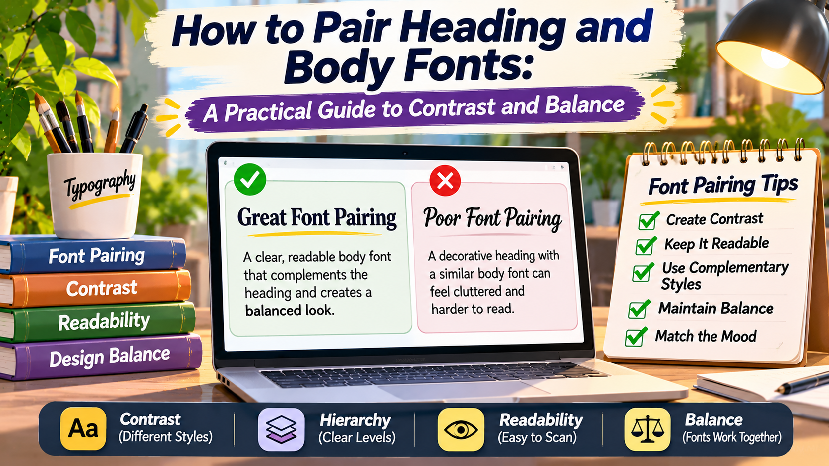
Typography Studio / The Art of Font Pairing
Two Fonts.
One Visual Language.
Learn how to combine heading and body typefaces that create contrast, maintain harmony, and make your content easier to read.
A Better Reading Experience
A distinctive heading attracts attention, while clear body typography keeps readers engaged with the content.
Choosing one font for a website can be challenging. Choosing two fonts that work well together requires even more attention.
Heading fonts and body fonts serve different purposes.
Headings establish hierarchy, introduce sections, and create visual personality.
Body text carries the main information and must remain comfortable to read across paragraphs, devices, and screen sizes.
When the two typefaces complement each other, the design feels organized and intentional.
When they compete, the result may appear inconsistent, crowded, or difficult to navigate.
Effective font pairing is not about finding two attractive typefaces independently.
It is about understanding how their shapes, proportions, weights, and personalities interact.
This guide explains how to pair heading and body fonts using practical principles of contrast, balance, readability, and visual consistency.
Why Heading and Body Fonts Need Different Roles
A heading and a paragraph perform different jobs within a layout.
A heading should help readers understand the structure of the content.
It may also communicate a brand’s personality through distinctive letterforms, weight, or proportions.
Body text should support continuous reading.
It usually benefits from clear characters, comfortable spacing, and restrained visual styling.
These differences explain why designers sometimes choose separate font families for headings and paragraphs.
However, using two families is not mandatory.
A single well-designed typeface family with multiple weights and styles can create an effective typography system.
The goal is to establish clear hierarchy rather than introduce variety for its own sake.
The Core Principle
Contrast creates distinction. Balance creates unity.
Good font pairing gives headings and paragraphs recognizable roles while making them feel like parts of the same design.
Understand Contrast in Font Pairing
Contrast helps readers distinguish one typographic element from another.
Designers can create contrast through font category, size, weight, width, structure, and style.
For example, a traditional serif heading paired with a modern sans serif body font creates contrast through different letterform details.
A bold heading and regular-weight paragraph create contrast through weight.
A large display heading and smaller body text establish hierarchy through scale.
However, more contrast is not always better.
Two highly decorative fonts may compete for attention.
Similarly, two typefaces that look almost identical may create an awkward combination because their small differences appear accidental.
Strong pairings usually have a clear relationship: the fonts are different enough to serve separate roles but compatible enough to feel intentional.
1. Serif Headings With Sans Serif Body Text
One widely used pairing combines a serif typeface for headings with a sans serif typeface for paragraphs.
Serif headings can introduce editorial character, elegance, or traditional visual details.
Sans serif body text can provide a contrasting texture and a straightforward reading experience.
This combination is common in editorial websites, portfolios, magazines, and brand storytelling pages.
Pairing Example 01 / Editorial
Designing for Meaning
Thoughtful typography creates a clear reading experience by combining expressive headlines with comfortable paragraph text.
Illustrative combination: Georgia heading + Arial body
The heading feels distinctive without making the body text difficult to read.
When using this approach, compare the fonts’ proportions carefully.
A very delicate serif heading may feel disconnected from an unusually heavy sans serif body.
Adjusting weight and size can help the combination feel more balanced.
2. Sans Serif Headings With Serif Body Text
The reverse combination can also work effectively.
A strong sans serif heading provides a clean structural element, while serif body text introduces a more traditional reading texture.
This approach may suit educational publications, long-form articles, research-oriented websites, and editorial projects.
Pairing Example 02 / Contemporary Classic
The Future of Reading
Typography continues to evolve, but careful attention to spacing, proportion, and hierarchy remains central to comfortable reading.
Illustrative combination: Arial heading + Georgia body
This pairing can create a useful balance between contemporary structure and editorial warmth.
However, not every serif typeface is suitable for body text.
Choose a family with clear letterforms and test it at the intended reading size.
3. Using One Font Family With Different Weights
Sometimes the most effective pairing uses only one typeface family.
For example, a bold heading and regular body text can create enough contrast without introducing a second font.
This approach often works well for dashboards, software applications, documentation websites, and minimalist brands.
Using one family can simplify typography decisions and help maintain visual consistency.
It may also reduce the number of font files required, depending on how the fonts are delivered.
Pairing Example 03 / Unified Family
Simple Systems Work
A single typeface can create a complete hierarchy through carefully chosen sizes, weights, and spacing.
Illustrative combination: Arial Bold + Arial Regular
This approach is especially useful when clarity and consistency are more important than decorative expression.
4. Slab Serif Headings With Neutral Body Fonts
Slab serif typefaces often have substantial, block-like serifs.
They can create strong visual emphasis in headings.
Pairing a slab serif heading with a restrained body font can help maintain balance.
This combination may suit product branding, posters, editorial sections, and websites that need distinctive headlines.
However, heavy display typography should be used thoughtfully.
Large slab serif headings can dominate the page if every section uses the same visual intensity.
Allow enough whitespace around headings and keep paragraph typography relatively simple.
5. Decorative Headings With Simple Body Text
Decorative fonts can give a design a recognizable personality.
Script, handwritten, or highly stylized display typefaces may work well for short headings, logos, or promotional messages.
However, these fonts often become difficult to read in long paragraphs.
A practical solution is to use the decorative font selectively and pair it with a clear body typeface.
For example, an invitation website might use an elegant script for a short introductory heading and a simple serif or sans serif for event details.
This preserves the expressive character of the design without sacrificing readability.
How to Evaluate Visual Balance Between Fonts
Two fonts can belong to compatible categories and still feel mismatched.
This often happens because their proportions, visual weights, or letter structures differ too much.
When evaluating a pairing, look beyond the font names.
Compare the height of lowercase letters, the width of characters, the shape of rounded letters, and the overall darkness of the text.
For example, a heading font with very narrow letters may look unusual next to a body font with extremely wide proportions.
This is not always a problem, but the contrast should appear deliberate.
Visual balance also depends on how much space each element occupies.
A large bold heading may need more breathing room than a smaller, lighter heading.
Spacing and layout can help two different typefaces feel connected.
The Importance of X-Height and Letter Proportions
X-height refers to the height of typical lowercase letters, such as x, excluding ascenders and descenders.
Typefaces with different x-heights can appear noticeably different even when they use the same nominal font size.
For example, one font set at 16 pixels may appear larger than another font set at the same size.
This happens because font size does not describe every visible dimension of the letterforms.
When pairing fonts, compare their actual appearance rather than assuming identical size values will create visual balance.
You may need to adjust the heading size or body size slightly to achieve the intended hierarchy.
Letter width also matters.
Condensed headings can create a compact, energetic appearance, while wider body letters may feel more open.
The relationship should support the design rather than appear accidental.
Choose Appropriate Font Weights
Font weight influences how strongly text attracts attention.
Bold headings are common because they establish clear hierarchy.
Body text often uses regular or medium weights to support continuous reading.
However, extremely light body text can become difficult to read, especially on smaller screens.
Heavy body text can also make long paragraphs feel visually dense.
Choose weights according to the typeface and context.
Not every font family has the same range of weights.
Some provide only regular and bold styles, while others offer several intermediate options.
Variable fonts may provide continuous weight adjustment along a supported axis.
The goal is to create a hierarchy that readers can recognize immediately.
Font Size and Line Height: Making Pairings Readable
Even a strong font pairing can fail when sizes and spacing are poorly chosen.
Body text should be comfortable to read on the intended devices.
Line height should provide enough vertical space to distinguish neighboring lines.
Headings may use tighter line spacing than paragraphs, particularly when displayed at large sizes.
However, very tight heading spacing can cause letters or lines to collide.
Paragraph width also influences readability.
Extremely long lines can make it harder for readers to move from the end of one line to the beginning of the next.
Instead of applying one universal formula, test typography with realistic content and screen sizes.
Practical Typography Tip
Design With Real Content
A short sample sentence may look perfect, but a complete article reveals how headings, paragraphs, lists, and captions work together. Test your font pairing using the content your readers will actually see.
A Practical Font Pairing Comparison
The following table summarizes several common pairing strategies.
| Heading Font | Body Font | Typical Style | Best Consideration |
|---|---|---|---|
| Serif | Sans Serif | Editorial and expressive | Balance decorative detail |
| Sans Serif | Serif | Contemporary classic | Check body readability |
| Bold Sans Serif | Regular Sans Serif | Minimal and practical | Use clear weight hierarchy |
| Slab Serif | Neutral Sans Serif | Bold and structured | Manage heading emphasis |
| Decorative Script | Simple Serif or Sans | Expressive and personal | Keep essential text clear |
These combinations are starting points rather than strict design rules.
The individual typefaces and their implementation matter more than the category names alone.
How to Test Font Pairings on Mobile Devices
Typography that looks balanced on a large desktop screen may behave differently on a smartphone.
Large headings can wrap into several lines.
Long words may create awkward breaks.
Small body text may become difficult to read.
Test your pairing at several viewport widths.
Pay attention to heading line breaks, paragraph spacing, navigation labels, and buttons.
Some designs benefit from slightly reducing display heading sizes on smaller screens.
However, body text should remain comfortable and accessible.
Responsive typography should preserve the intended hierarchy rather than simply shrinking every element proportionally.
Accessibility Considerations for Font Pairing
Accessible typography depends on more than font category.
Letter clarity, size, spacing, contrast, and layout all contribute to readability.
WCAG Level AA generally requires a contrast ratio of at least 4.5:1 for normal text and 3:1 for large text.
These requirements apply to the text and its background rather than to the font family itself.
Decorative headings should remain understandable, and important information should not depend on difficult-to-read lettering.
Also test whether the layout remains usable when readers enlarge text or adjust browser settings.
A font pairing should support readers with different devices, preferences, and visual abilities.
Common Font Pairing Mistakes
One common mistake is choosing two fonts that are both highly decorative.
When every element demands attention, the visual hierarchy becomes unclear.
Another mistake is pairing two nearly identical fonts without a meaningful reason.
The subtle differences may make the typography appear inconsistent rather than intentional.
Other common problems include:
- Using too many unrelated font families.
- Choosing headings that overpower the body text.
- Ignoring differences in x-height and proportions.
- Using very light weights for long paragraphs.
- Failing to test typography on mobile screens.
- Overlooking language support and font licensing.
- Choosing fonts based only on short sample images.
Most of these issues can be avoided through careful comparison and testing with real content.
A Five-Step Process for Choosing Font Pairs
Frequently Asked Questions
Should heading and body fonts be different?
Not necessarily. A single font family can create effective hierarchy through different sizes, weights, and styles.
Is serif and sans serif a good font combination?
Yes. Serif and sans serif typefaces can create useful contrast, but the specific families must still be evaluated for visual compatibility and readability.
How many fonts should a website use?
Many websites work well with one or two families. Additional fonts may be appropriate when they serve a clear purpose, but unnecessary variety can reduce consistency.
What makes two fonts look balanced?
Compatible proportions, appropriate weights, clear hierarchy, and thoughtful spacing all contribute to visual balance.
Can decorative fonts be used for headings?
Yes. Decorative typefaces can work for short display headings when the text remains readable and the body typography provides a clear contrast.
What is the biggest mistake in font pairing?
One major mistake is choosing fonts independently without considering how they interact in the complete layout.
Final Thoughts
Pairing heading and body fonts is an exercise in contrast and balance.
Headings should create clear visual hierarchy and support the personality of the design.
Body text should remain comfortable to read and consistent across different layouts.
Serif and sans serif combinations can work well, but they are not the only solution.
A single typeface family may be equally effective when its weights and styles provide sufficient distinction.
The most important factors are the actual letterforms, proportions, spacing, readability, and intended audience.
Choose fonts according to their roles, test them with real content, and refine the relationship between headings and paragraphs.
When the pairing feels intentional, typography becomes a quiet but powerful part of the reading experience.
The Font Pairing Formula
Clear Contrast + Visual Harmony + Comfortable Reading
The strongest font combinations create distinction without distraction and help every part of the design communicate its purpose.