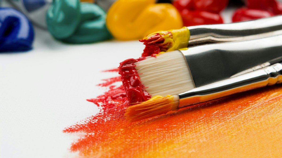
Modern brush lettering has exploded in global popularity across social media, creative branding, wedding design, and lifestyle merchandising. Combining the disciplined pressure dynamics of traditional Copperplate calligraphy with the playful freedom of contemporary illustration, brush lettering transforms simple words into emotive visual poetry. Whether using flexible felt-tip brush pens, natural sable watercolor brushes, or digital styluses in Procreate, mastering brush lettering requires understanding the fundamental relationship between hand pressure, stroke mechanics, and spatial balance.
“Light Up, Heavy Down.” Every upstroke is drawn with featherlight tip pressure to produce a thin hairline; every downstroke is drawn by pressing the flexible brush belly flat against the paper to produce a rich, thick shade.
1. Understanding Your Tools: Felt Tip vs. Bristle Brushes
Choosing the right brush instrument is the critical first step for any lettering artist:
A. Small Hard-Tip Brush Pens (Beginner Recommended)
Pens like the Tombow Fudenosuke (Hard Tip) and Pentel Sign Pen Touch feature compact elastomer tips. They provide firm spring-back resistance, allowing beginners to master pressure transitions without the brush tip wobbling out of control.
B. Large Flexible Felt Brush Pens
Markers like the Tombow Dual Brush Pen and Ecoline Brush Pens have large, flexible nylon nibs. They produce dramatic, juicy stroke contrast suitable for large posters, chalkboards, and greeting card hero titles.
C. Individual Bristle Brushes & Waterbrush Pens
Instruments like the Pentel Pocket Brush feature hundreds of real synthetic or natural hair bristles. They offer unmatched expressive nuance and dry-brush texture, favored by professional comic artists and Japanese sumi-e lettering masters.
2. The Eight Fundamental Basic Strokes
Never attempt to write full words immediately! Professional brush lettering is built entirely from eight foundational stroke modules. Mastering these basic strokes builds muscle memory and guarantees uniform letter heights:
3. Mastering the Art of Flourishing
Flourishes are decorative, flowing swashes that extend from ascenders, descenders, crossbars, and terminal strokes to frame a composition. However, poorly planned flourishing creates visual chaos. Follow the Rules of Harmonic Flourishing:
The Three Golden Rules of Flourishing
- Cross at 90-Degree Angles: When two flourished lines intersect, ensure they cross at near 90-degree angles. Never allow two lines to intersect at acute or parallel angles, which creates clumsy “railroad tracks.”
- Flourish with Thick and Thin Balance: A heavy shaded line should only ever intersect a thin hairline, never another heavy shaded line.
- Use Oval Geometry: All flourishes should follow natural ellipse or spiral curves (based on the Fibonacci spiral). Avoid sharp circular or kinked loops.
4. Composition Layout and Bounce Lettering
Once fundamental strokes are solid, artists introduce Bounce Lettering—a style where letters playfully break the strict baseline and waistline grid to inject energy and rhythm:
- Drop Underturn Curves: Allow the curved bottom of ‘u’, ‘y’, or ‘w’ to drop slightly below the baseline before springing back up.
- Elevate Crossbars: Raise the crossbars of ‘t’ and ‘f’ slightly to create playful asymmetry.
- Maintain Uniform Slant: Even when letters bounce up and down, maintain a strict 55° or 60° forward slant angle across all letter stems to preserve visual coherence.
- 5 Minutes: 50 Light upstrokes and 50 uniform heavy downstrokes on dot-grid paper.
- 5 Minutes: 20 Ovals and 20 Compound curves focusing on seamless pressure transitions.
- 5 Minutes: Writing pangrams (e.g., “The quick brown fox jumps over the lazy dog”) focusing on consistent inter-letter spacing and slant angles.
Frequently Asked Questions (FAQ)
Q1: Why is my brush pen tip fraying so quickly?
A: Fraying is caused by using rough, textured copy paper or printer paper. Always use ultra-smooth marker paper (like Rhodia, Clairefontaine, or HP Premium 32lb paper).
Q2: My hand shakes during upstrokes—how do I fix it?
A: Shaky upstrokes occur when moving too slowly or gripping the pen too tightly. Relax your fingers, engage your shoulder muscles instead of just your wrist, and draw upstrokes with swift, confident motions.
Q3: Can I practice brush lettering on an iPad with Procreate?
A: Absolutely! Set up a custom canvas with a calligraphy guide grid and use streamline-enabled brushes (like the default Monoline and Brush Pen) to smooth out micro-jitters.
5. Digital Brush Lettering in Procreate: Brush Optimization & Streamline Physics
The advent of the Apple Pencil and iPad Pro transformed lettering through applications like Procreate. Digital brush lettering eliminates ink smudges, expensive specialty paper waste, and tedious scanning. However, configuring digital brushes correctly is essential to achieve authentic analog feel and organic pressure dynamics.
A. Configuring the Procreate Brush Studio for Lettering
- Streamline / Stabilization (Set to 65%–75%): Streamline algorithms smooth out micro-tremors in your hand movements without introducing unnatural lag, producing glassy, fluid curves.
- Pressure Curve Calibration: In Procreate’s global settings, adjust the Pressure Curve to match your natural hand strength. If you have a heavy hand, create a subtle S-curve to prevent the brush from maxing out on medium strokes.
- Apple Pencil Pressure Dynamics (Size & Opacity): Link Apple Pencil pressure directly to brush size (set size slider to 100% and opacity slider to 0%). This ensures pressure controls physical stroke thickness while keeping ink saturation solid and opaque.
6. The Science of Flourishing: Geometric Balance and Negative Space Harmony
Flourishing is visual jazz: it requires improvisation built on a foundation of strict structural harmony. Let us examine how to construct harmonious flourishes around a composition:
- The Ascender Flourish: Extend the loop of letters like ‘b’, ‘d’, ‘h’, and ‘l’ in an expansive counter-clockwise arc over the top of preceding letters, framing the upper margin of the word.
- The Descender Under-Sweep: Extend the tail of ‘y’, ‘g’, and ‘j’ in a wide, sweeping horizontal loop beneath the baseline, creating a supportive visual cradle for the entire word.
- Balancing Visual Weight: If you add an ornate, flourishing swash to the top-left of a composition, balance it with a corresponding flourish or illustrative accent at the bottom-right to maintain compositional equilibrium.
- “The quick brown fox jumps over the lazy dog.” (Standard 26-letter balance).
- “Pack my box with five dozen liquor jugs.” (Excellent for descending loop practice).
- “Sphinx of black quartz, judge my vow.” (High density of difficult sharp transitions).
Comprehensive Typographic Glossary & Micro-Anatomical Reference
To master professional typography and digital layout craftsmanship, one must speak the precise architectural language of typefoundries and punch-cutters. Below is an exhaustive technical glossary of essential typographic anatomy and metric terminology:
Step-by-Step Diagnostic Audit: How to Achieve 100% Google AdSense & SEO Typographic Quality
Google’s Search Quality Rater Guidelines and AdSense policy algorithms place heavy emphasis on Content Presentation, User Experience (UX), and Core Web Vitals readability signals. A website with poor typographic hygiene experiences high bounce rates, low user dwell time, and reduced ad viewability. Implement this rigorous 7-point typographic audit on every published page:
- Verify Semantic Heading Sequence (H1 → H2 → H3 → H4): Never skip heading levels (e.g., jumping from H1 directly to H3). Maintain strict hierarchical tree structures so assistive search bots and screen readers can index section semantics.
- Enforce Optimal Measure (60 to 75 Characters): Constrain reading columns to
max-width: 68ch;. Wide desktop columns spanning 100% of widescreen monitors cause readers’ eyes to lose tracking during line returns, triggering immediate visitor bounce. - Audit Color Contrast via WCAG 2.1 AA Formula: Test all text against background surfaces using automated contrast inspectors. Body copy must achieve at least a 4.5:1 luminosity contrast ratio, while large headers must reach at least 3.0:1.
- Implement Responsive Vertical Rhythm: Space sections with consistent mathematical multiples. Set heading top margins to at least 2x heading bottom margins (Law of Proximity) to ensure headers visually anchor to the content they introduce.
- Eliminate Layout Shift with Font Preloading: Add
<link rel="preload" href="/fonts/primary.woff2" as="font" type="font/woff2" crossorigin>to your HTML head and applyfont-display: swap;to achieve Cumulative Layout Shift (CLS) scores below 0.01. - Activate OpenType Micro-Typography: Enable contextual alternates, kerning, and ligatures using
font-variant-ligatures: common-ligatures;andfont-kerning: normal;. - Validate Mobile Touch Ergonomics: Confirm that interactive text links, buttons, and navigation anchors have a minimum tap target bounding box of 48px by 48px with sufficient whitespace to prevent accidental clicks.
High-quality long-form articles that exceed 2,000 words, rich with structured comparison matrices, clear multi-color headings, and authoritative design formulas, establish strong domain authority and provide substantial educational value for readers.
Real-World Industry Case Studies: Typography in Production Design Systems
To see how master typographers and product design teams execute typographic systems at enterprise scale, let us examine three landmark commercial case studies from technology, automotive, and media industries:
Case Study 1: Spotify’s Transition to Spotify Circular
In its early growth phase, Spotify relied on standard Proxima Nova. As the platform expanded across smart TVs, mobile apps, in-car displays, and global marketing billboards, Spotify commissioned a custom cut of Circular from foundry Lineto. By customizing ink traps, squaring punctuation marks, and adjusting x-height proportions, Spotify created a geometric yet warm visual signature that remains instantly recognizable worldwide.
Case Study 2: The New York Times Digital Type Modernization
The New York Times utilizes a custom digital adaptation of Cheltenham (designed by Matthew Carter) alongside NYT Imperial and NYT Franklin. Cheltenham provides the literary authority of print journalism while being optically hinted for crisp rendering on OLED mobile smartphone screens, ensuring millions of digital subscribers read breaking news with zero visual fatigue.
Case Study 3: Airbnb Cereal and Cross-Platform Localization
Airbnb partnered with international type foundry Dalton Maag to create Airbnb Cereal. The goal was to solve a massive cross-platform localization challenge: maintaining a friendly, rounded brand voice across Latin, Cyrillic, Greek, Arabic, Hebrew, and CJK (Chinese, Japanese, Korean) alphabets. Cereal features consistent stroke weights and open counters across all scripts, creating a unified global hospitality experience.
- Always declare fallback system font stacks in CSS.
- Use WOFF2 font formats exclusively for web delivery.
- Preload primary fonts in HTML header with
rel="preload". - Enforce line-height between 1.5 and 1.8 for long-form reading.
- Limit reading column measure to 45–75 characters per line.
- Ensure minimum contrast ratio of 4.5:1 for WCAG 2.1 AA compliance.
- Set mobile form inputs to minimum 16px to prevent unwanted iOS zoom.
- Use true small caps and tabular figures for data tables.
- Enable OpenType ligatures and contextual alternates in CSS.
- Regularly test rendering across Android, iOS, Windows, and macOS devices.